This tutorial shows how data from a Microsoft Excel spread sheet document can be used to display a bar chart in Demorize.
Before we begin to show how data can be used in Demorize we need to create an Excel document and fill it with some data. For this example we are only going to use a single sheet of data so we create a new Excel document that we name ProductionData.xlsx and fill it with the data presented in Table 13.1, “Data in the Excel sheet named ProductionData.xlsx”.
Table 13.1. Data in the Excel sheet named ProductionData.xlsx
| Production Goal | Actual Production | |
| Shovels | 430 | 324 |
| Buckets | 1300 | 1250 |
| Rakes | 345 | 460 |
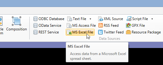
In Demorize we are now going to create a data source that uses the Excel document we created above. This is done by inserting a new data source into the project by clicking on the MS Excel File button in the Insert menu.
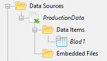
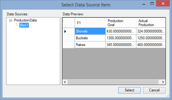
In the file dialog that appear we now select the Excel document. The data source is given a default name based on the file name of the document we select. This name can be changed but is used later to reference the data source when we create the bar chart diagram. You may also notice that something called a Data Item is created by default for the data source. This Data Item is given a name based on the first sheet in the Excel document. In our case, as shown in the image below, the first sheet was named Blad1 and thus the Data Item was named such.
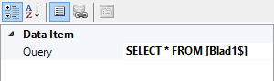
What the Data Item does is to select what data in the document that shall be referenced. In this case it is by default set to reference the first sheet but this can be changed if you want to for example get data from another sheet in the document. If we select the Data Item and look at the properties you will see an SQL query that defines what data to use from the document, as shown below.
We will later investigate how updates in the document are propagated to Demorize, but for now we are finished with the creation of the data source.
Creating a bar chart is as simple as pushing the Bar chart button in the Insert menu and selecting the Data Item that it shall present.
The bar chart that is added by default should look something like the image below.
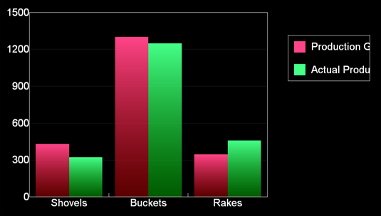
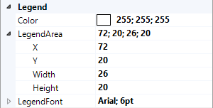
As you can see, the legend doesn't look quite right and might need some readjustment to fit the headings. These adjustments are done in the bar chart's properties. In this case we want to change the legend area to be placed at X 72 and with a width of 26. These values represent percentage of the total width of the bar chart object.
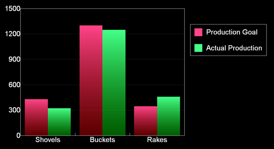
The chart will now look like below.
The bar chart will reflect the data that has been entered in the Excel document. The data is however by default only fetched at the beginning of the presentation stream. This means that the bar chart will not update directly if the data in the Excel sheet is changed but will wait until the presentation loops its stream. This might be the desired behavior if you have a presentation that consists of a number of scenes presented after each other. In such cases you might not want to confuse a reader by updating the data while the diagram is shown. However, for this tutorial we want the data to be automatically updated in a more live way while the chart is displayed.
To create a more live update of the data we need to change the Cache Mode of the data source. This is done by selecting the Data Source in the project view, which will display its properties in the property view.
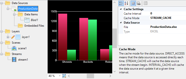
If we change the Cache Mode to be INTERVAL_CACHE instead, we can make the chart update itself at regular intervals. We also need to change the Cache Interval setting to for example 30. The chart will now fetch data from the Excel sheet every 30 seconds and redraw itself. This means that the Excel document can be freely edited and the chart presented by Demorize will be automatically updated when this happens.